
Finding the right look for your website can feel like a puzzle. You want it to be beautiful, but you also want it to be easy to read. In WordPress, two of the most powerful tools you have are fonts and colors. When you get these two right, your website looks professional and keeps visitors coming back.
Why Fonts and Colors Matter
Think of your website like a digital storefront. If the sign is hard to read or the colors clash, people might walk away before they even see what you are selling or writing about.
Fonts tell your readers what kind of “voice” you have. A bold font might look modern and strong, while a thin, cursive font looks elegant and soft. Colors create a mood. Blue often feels trustworthy, while red feels exciting or urgent.
Understanding WordPress Fonts
In the world of web design, there are three main types of fonts you will encounter in WordPress.
- Serif Fonts: These have little “feet” at the ends of the letters. Times New Roman is a famous example. They look traditional and formal.
- Sans-Serif Fonts: These are clean and do not have the little feet. Arial or Helvetica are good examples. They look modern and are very easy to read on computer screens.
- Display Fonts: These are decorative fonts used for titles. They are fun but should be used sparingly because they can be hard to read in long paragraphs.
How to Change Fonts in WordPress
Most modern WordPress themes allow you to change fonts without touching any code. You can usually find these settings by going to Appearance and then Customize. Look for a section called Typography.
From there, you can choose different fonts for your headings (the big titles) and your body text (the main paragraphs). A good rule of thumb is to use no more than two different fonts on your entire site. This keeps everything looking clean.
Choosing the Right Colors
Picking colors is more than just choosing your favorite shade. You need to think about contrast. Contrast is the difference between the color of your text and the color of the background.
If you have light gray text on a white background, your readers will strain their eyes. The best combination for reading is dark text on a light background.
Creating a Color Palette
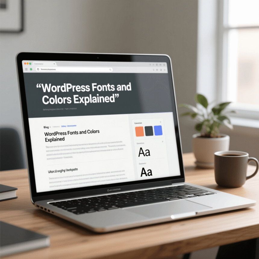
A color palette is a set of colors that work well together. Most websites use a primary color, a secondary color, and an accent color.
- Primary Color: This is your main brand color. It shows up in your logo and your main menu.
- Secondary Color: This supports the primary color and is used for less important areas.
- Accent Color: This is usually a bright color used for buttons or links. It should stand out so people know where to click.
Best Practices for a Better Website
To make sure your WordPress site looks its best, follow these simple tips.
- Readability First: Never sacrifice readability for style. If a font looks cool but is hard to read, don’t use it for your blog posts.
- Size Matters: Make sure your body text is large enough. A size of 16px or 18px is standard for most websites today.
- Mobile Testing: Always check your site on your phone. Sometimes a font that looks great on a laptop looks too small or crowded on a mobile screen.
- Consistency: Use the same fonts and colors on every page. This helps people recognize your brand.
Summary
Customizing your WordPress fonts and colors is one of the fastest ways to improve your site. By choosing clean fonts and high-contrast colors, you create a professional environment that is welcoming to every visitor.