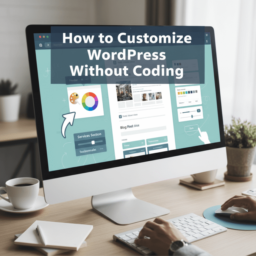
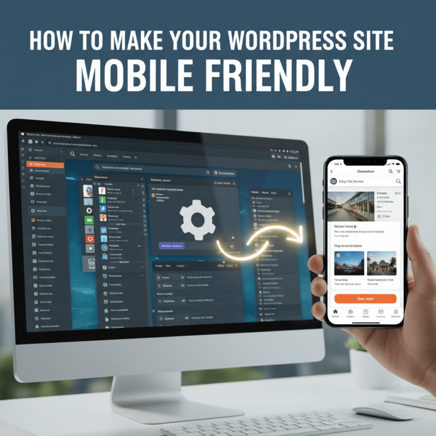
In today’s world, more people browse the internet on their phones than on computers. If your website looks great on a laptop but messy on a smartphone, you are likely losing a lot of readers. Making your WordPress site mobile friendly is no longer a luxury; it is a necessity.
Here is a simple guide to help you optimize your site for mobile users.
1. Choose a Responsive Theme
The easiest way to ensure your site looks good on all devices is to use a responsive theme. A responsive design automatically shrinks or expands your content to fit the screen size of the device being used.
When looking for a theme in the WordPress directory, check the description for the word “responsive.” Most modern themes are built this way by default, but it is always good to double check before installing.
2. Use Mobile Friendly Plugins
Sometimes your theme might need a little extra help. There are specific plugins designed to improve the mobile experience. These tools can help simplify your menus, resize your images, or create a specific mobile version of your site.
However, be careful not to install too many plugins. Having too many can actually slow down your site, which is bad for mobile users who might be on a slower data connection.
3. Optimize Your Images
Large image files are the biggest reason for slow loading times. On a mobile device, a slow site is frustrating and leads to people leaving immediately.
- Compress your images: Use tools like Smush or EWWW Image Optimizer to reduce file sizes without losing quality.
- Use the right format: Stick to WebP or JPEG for photographs and PNG for graphics with transparency.
4. Simplify Your Menus and Navigation
On a computer, you have plenty of space for a big navigation menu. On a phone, that same menu can cover the whole screen.
To fix this, use a hamburger menu (the three little horizontal lines in the corner). This keeps your site looking clean. Also, make sure your buttons are large enough to be clicked with a thumb. If buttons are too close together, users might click the wrong link by accident.
5. Avoid Intrusive Pop-ups
We have all experienced the frustration of landing on a website only to have a giant pop-up block the entire screen. On a mobile phone, these pop-ups are even harder to close because the “X” button is often tiny.
If you must use pop-ups for sign ups or announcements, make sure they are designed specifically for mobile or set them to appear only after a user has scrolled down a significant portion of the page.
6. Test Your Progress
You don’t need to guess if your site is working well. You can test it yourself very easily.
- Use your own phone: Open your site on your smartphone and try to navigate through your pages.
- Browser tools: On your computer, you can right click on your website, select “Inspect,” and click the device icon to see how it looks on different screen sizes.
Conclusion
Making your WordPress site mobile friendly is all about speed and simplicity. By choosing the right theme, shrinking your images, and keeping your layout clean, you create a much better experience for your visitors. When your site is easy to use on a phone, people are more likely to stay longer and come back again.