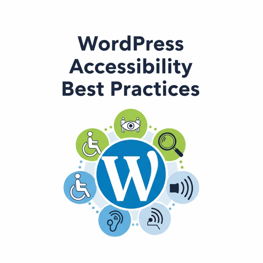
Making your website accessible means ensuring that everyone, including people with disabilities, can use your site effectively. When you build with accessibility in mind, you aren’t just helping a specific group; you are actually making your site better for search engines and mobile users too.
Here are the best practices to make your WordPress site inclusive and user-friendly.
1. Choose an Accessibility-Ready Theme
The foundation of your site is your theme. Many WordPress themes are beautiful but difficult to navigate for people using screen readers or keyboard-only navigation.
When searching for a theme in the WordPress directory, use the Feature Filter and check the box for Accessibility Ready. These themes have undergone a review to ensure they meet basic standards, such as proper contrast and keyboard navigation support.
2. Use Proper Heading Structure
Headings help organize your content for readers, but they are also vital for screen readers. A person with a visual impairment might use a shortcut to list all the headings on a page to understand the layout.
- H1: Use this only for the main title of the page.
- H2: Use these for the main sections.
- H3 to H6: Use these for sub-sections under an H2.
Never skip a heading level (for example, jumping from an H2 to an H4) just because you like the font size. Use CSS if you want to change how the text looks.
3. Add Alt Text to All Images
Search engines and screen readers cannot “see” images. They rely on Alternative Text (Alt Text) to understand what is in a picture.
- Be descriptive: Instead of “dog,” use “a golden retriever playing with a red ball.”
- Be concise: Keep it to one short sentence.
- Skip decorative images: If an image is just a border or a background shape that adds no meaning, you can leave the alt text blank so screen readers skip it.
4. Ensure High Color Contrast
If your text color is too similar to your background color, people with low vision or color blindness will struggle to read it. For example, light gray text on a white background is very hard to see.
Use a contrast checker tool to make sure your text stands out. A good rule of thumb is to aim for a contrast ratio of at least 4.5:1 for regular text.
5. Make Your Links Descriptive
Avoid using links that say “Click Here” or “Read More.” These phrases tell the user nothing about where the link leads if they are reading the link out of context.
Instead, use descriptive text like “Download our accessibility checklist” or “Learn more about our services.” This tells the user exactly what to expect when they click.
6. Enable Keyboard Navigation
Some users cannot use a mouse and rely entirely on the “Tab” key to move through a website.
- Focus Indicators: Ensure there is a visible outline around links or buttons when they are highlighted.
- Skip to Content: High-quality themes often include a hidden “Skip to Content” link at the top. This allows keyboard users to jump past the main menu directly to the article.
7. Use Accessible Forms
Forms are often the most difficult part of a website for users with disabilities.
- Labels: Every form field must have a clear label. Do not rely on “placeholder text” inside the box, as it often disappears when the user starts typing.
- Error Messages: If someone makes a mistake, the error message should be clear and easy to find.
8. Be Careful with Automatic Media
Avoid setting videos or music to “Autoplay” when a page loads. This can be incredibly confusing for people using screen readers, as the audio from the video will clash with the voice of their screen reader. If you do use video, try to provide captions or a transcript for those who are deaf or hard of hearing.
By following these steps, you make your WordPress site a welcoming place for everyone. Accessibility is not a one-time task but an ongoing commitment to providing a better experience for all your visitors.