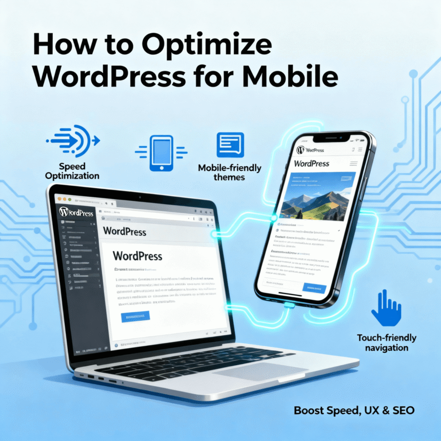
In today’s world, most people browse the internet using their smartphones. If your WordPress site looks great on a computer but messy on a phone, you are likely losing a lot of visitors. Search engines also prefer websites that work well on mobile devices.
Optimizing your site for mobile is not just about making things smaller. It is about speed, easy navigation, and a smooth experience for the user. Here is a simple guide on how to optimize WordPress for mobile.
Choose a Responsive Theme
The foundation of a mobile-friendly site is a responsive theme. A responsive theme automatically changes its layout to fit the screen size of the device being used.
When picking a theme, look for these features:
- Fluid Grids: The layout should resize proportionally.
- Mobile-First Design: Some themes are built specifically for mobile users first.
- Lightweight Code: Avoid themes with too many built-in features you don’t need, as they can slow down your site.
Popular options like Astra, GeneratePress, and Neve are known for being very fast and mobile-responsive.
Improve Loading Speed
Mobile users are often on the go and may not have a fast internet connection. If your page takes more than three seconds to load, most people will leave.
Compress Your Images
Large images are the biggest reason for slow mobile sites. You should use tools or plugins like Smush or ShortPixel to shrink the file size of your images without losing quality. Using modern formats like WebP instead of PNG or JPEG can also make a huge difference.
Use a Caching Plugin
Caching creates a “static” version of your site so the server doesn’t have to work as hard every time someone visits. Plugins like WP Rocket or LiteSpeed Cache are excellent for this.
Enable a Content Delivery Network (CDN)
A CDN stores copies of your site on servers all around the world. When someone visits your site, the data is sent from the server closest to them, making the load time much faster.
Simplify Your Navigation
On a large desktop screen, you can have many menu items. On a small phone screen, a big menu is confusing and hard to use.
- Use a Hamburger Menu: This is the icon with three lines that expands when tapped. It keeps the screen clean.
- Prioritize Important Links: Only show the most important pages in your mobile menu.
- Make Buttons Large: Ensure that buttons and links are easy to tap with a thumb. If they are too small or too close together, users will get frustrated.
Optimize Your Content for Small Screens
Reading a long wall of text on a phone is difficult. To make your content more readable:
- Use Short Paragraphs: Keep them to 2 or 3 sentences.
- Use Large Fonts: A font size of at least 16px is usually best for mobile readability.
- Avoid Pop-ups: Large pop-ups can be very hard to close on a mobile device and can even hurt your search engine rankings.
Test Your Website Regularly
You should always check how your site looks on actual devices. You can use free tools like Google PageSpeed Insights to see how your site performs on mobile. It will give you a score and tell you exactly what you need to fix.
By following these steps, you will provide a better experience for your visitors and help your website grow.