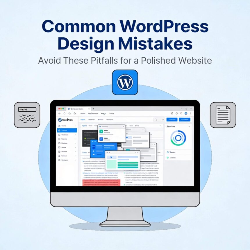
Building a website with WordPress is exciting. It is a powerful tool that helps anyone create a beautiful online space. However, many people make simple design errors that can drive visitors away. If your site feels “off” or isn’t getting the results you want, you might be falling into these common traps.
Here are the most common WordPress design mistakes and how you can fix them to create a better experience for your readers.
1. Choosing a Poor Quality Theme
The theme is the foundation of your website. Many beginners choose a theme based only on how it looks in the preview. This is a mistake.
A theme might look pretty but could be coded poorly. Heavy themes can slow down your website, making it frustrating for users. Always look for themes that are “lightweight” and “responsive.” A responsive theme ensures your site looks great on both a computer and a smartphone.
2. Using Too Many Plugins
One of the best things about WordPress is the plugins. They add extra features easily. But adding too many plugins is a major design and performance mistake.
Every plugin you add requires your website to load more code. This slows down your page speed. Also, having too many plugins increases the risk of software conflicts, which can break your site’s layout. Stick to the essentials. If you aren’t using a plugin, delete it.
3. Ignoring Mobile Users
Most people browse the internet on their phones today. If your WordPress site only looks good on a desktop, you are losing visitors.
Common mobile mistakes include:
- Buttons that are too small to click.
- Text that is too tiny to read without zooming.
- Pop-ups that cover the entire screen and are hard to close.
Always check your site on your phone after making design changes.
4. Cluttered Sidebars and Headers
It is tempting to put everything in your sidebar: archives, recent posts, social media feeds, and search bars. However, a cluttered design distracts your visitors from your actual content.
A clean design helps people focus on what is important. Keep your header simple with an easy-to-use menu. In the sidebar, only keep the items that truly help the user navigate your site.
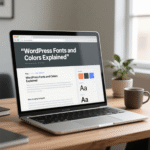
5. Hard to Read Fonts and Colors
Design is not just about looking cool; it is about readability. Some WordPress users choose fancy script fonts or light grey text on a white background. This makes the content very hard to read.
- Font Choice: Use standard, clean fonts for your body text. Save the fancy fonts for headings.
- Contrast: Ensure there is a strong contrast between your text and your background. Dark text on a light background is usually the safest choice.
- Line Spacing: Give your text some room to breathe. If the lines are too close together, it feels overwhelming to read.
6. Using Low-Quality Images
Images bring a blog to life, but bad images can ruin a professional look. Avoid using blurry photos or images that are stretched out of proportion.
Another mistake is uploading images that are too large in file size. Large images take a long time to load. Use a tool to compress your images before you upload them to WordPress. This keeps your site looking sharp and running fast.
7. Complicated Navigation
If a visitor cannot find what they are looking for within a few seconds, they will leave. A common mistake is creating a navigation menu that is too complex or uses confusing labels.
Keep your menu simple. Use clear words like “Home,” “Blog,” and “Contact.” If you have a lot of pages, use a “dropdown” menu to organize them neatly.
8. Forgetting the Search Bar
As you add more content to your WordPress site, it becomes harder for users to find specific posts. Not having a search bar is a design flaw. Make sure your search bar is in a visible place, like the header or the top of the sidebar, so visitors can find exactly what they need.
Summary
Avoiding these WordPress design mistakes will help you create a website that is professional, fast, and easy to use. Focus on simplicity. When your site is clean and easy to navigate, your visitors will stay longer and come back more often.